Background
The 911 system facilitates emergency response to hundreds of millions of calls each year—but by design or default, the system initiates an armed law enforcement response whether that’s what a situation calls for or not. We’ve seen over and over again that an armed law enforcement response is not a one-size-fits-all solution.
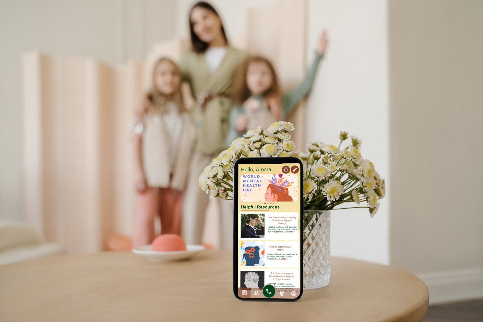
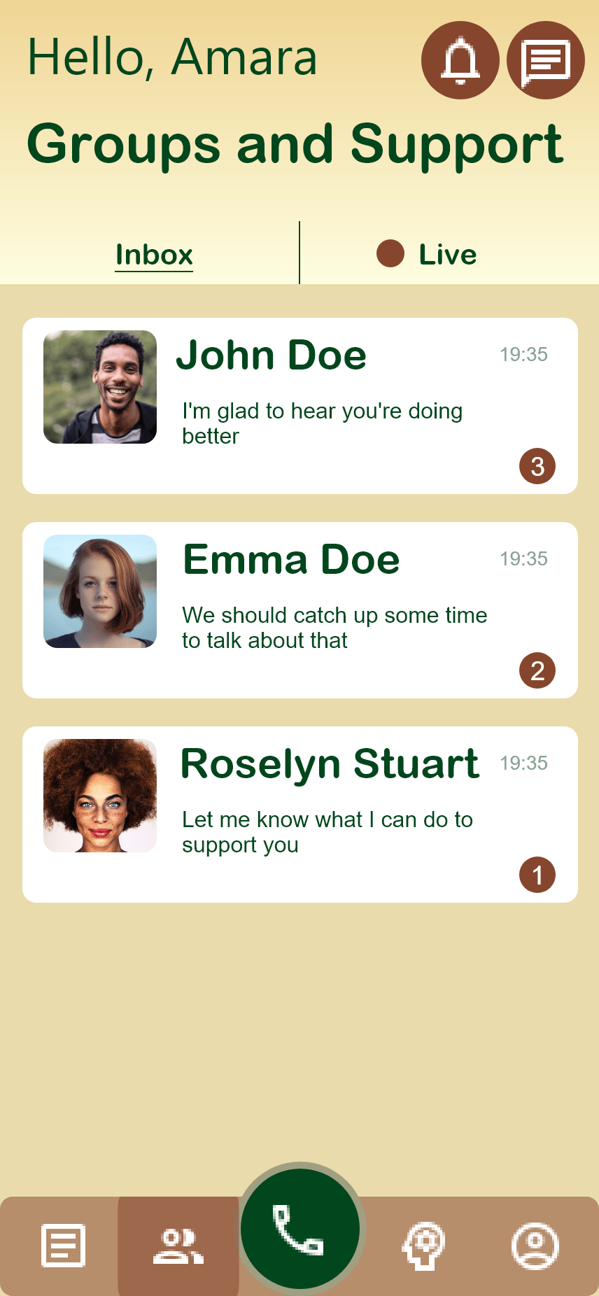
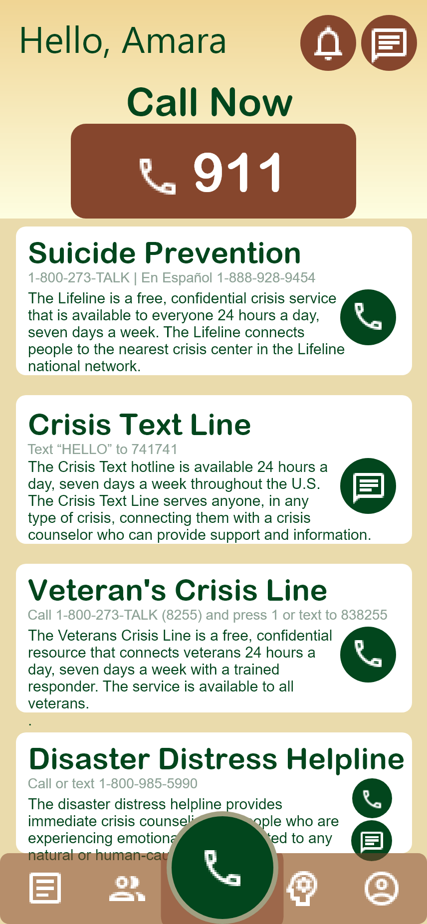
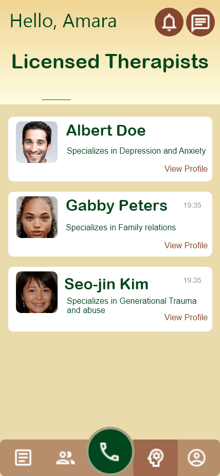
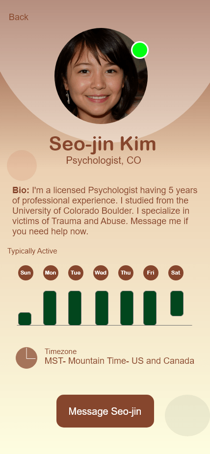
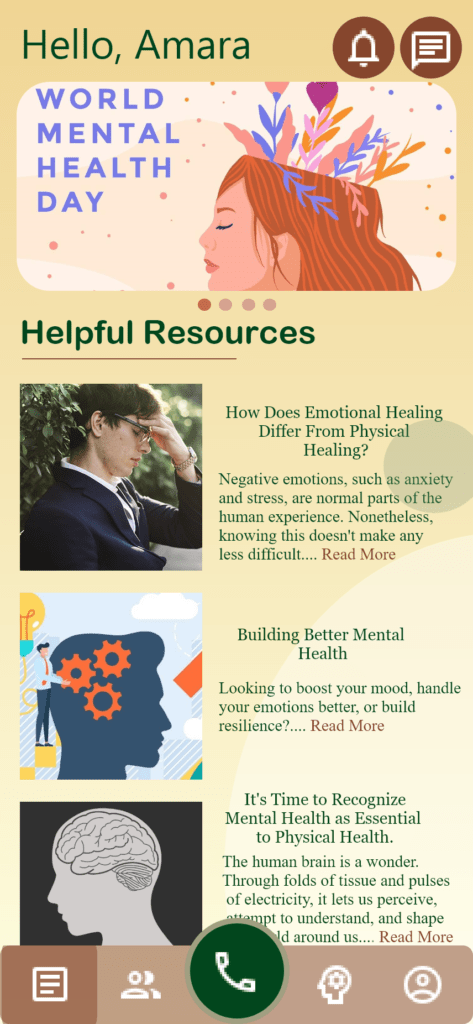
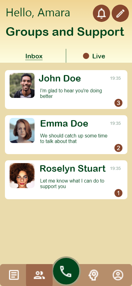
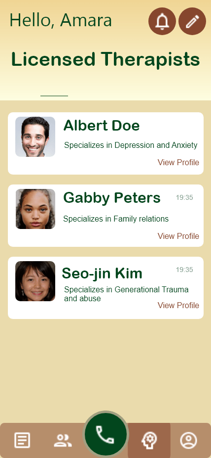
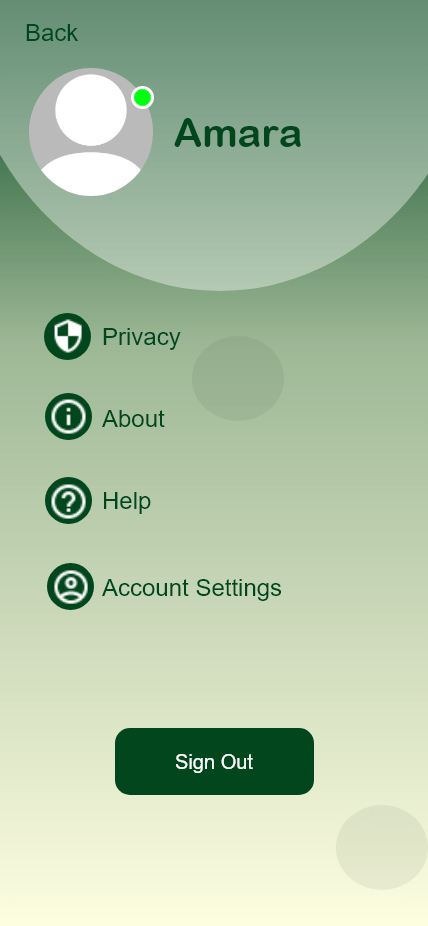
Final Designs


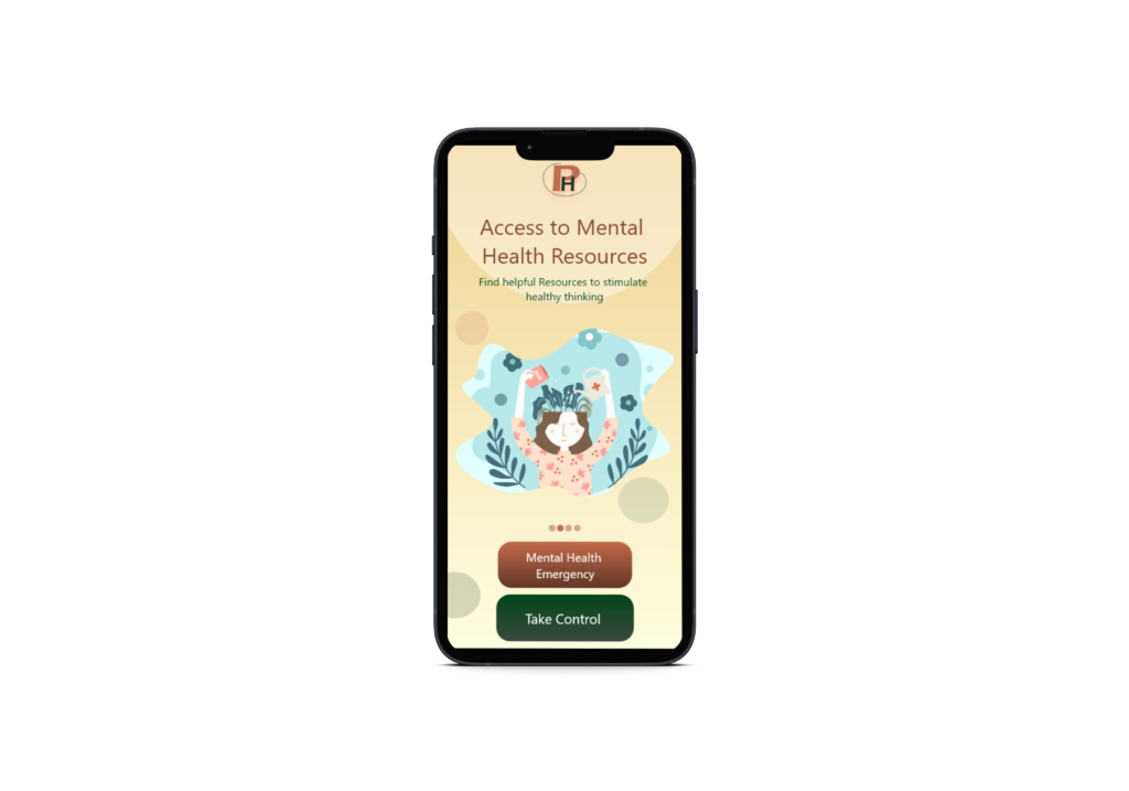
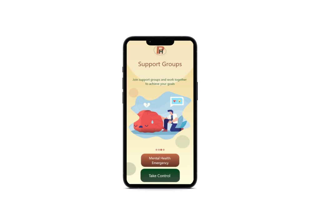
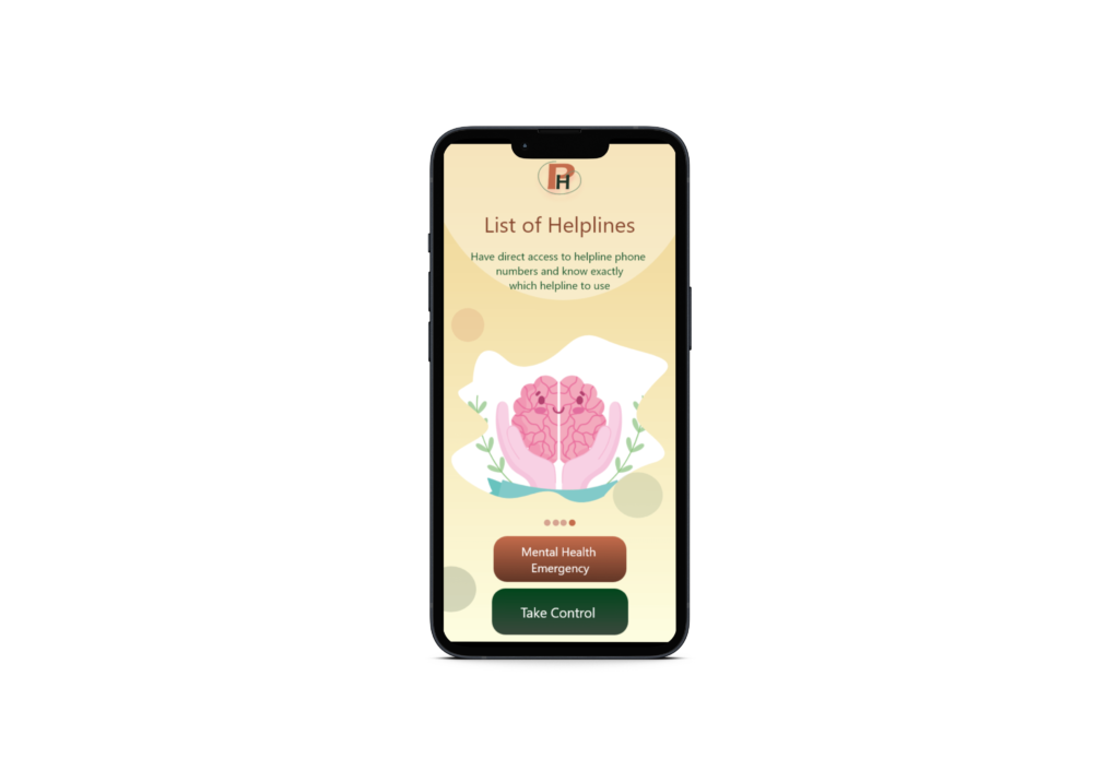
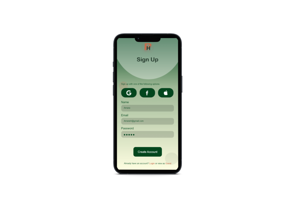
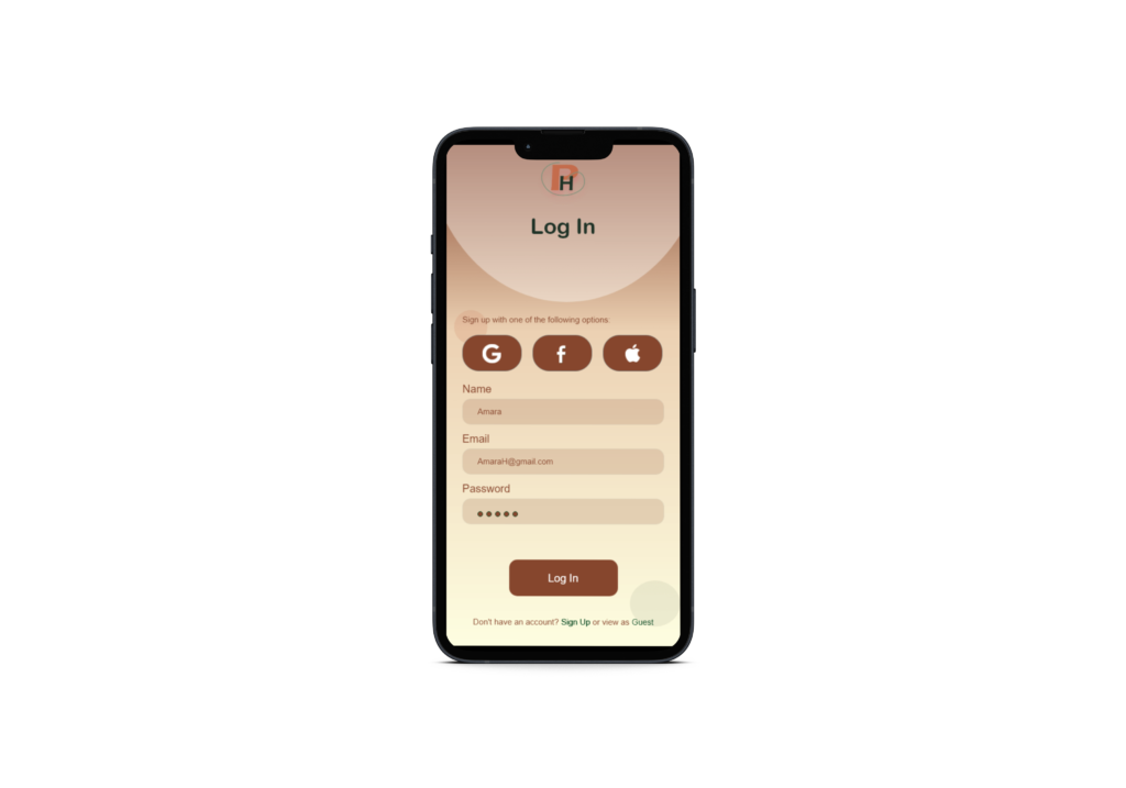
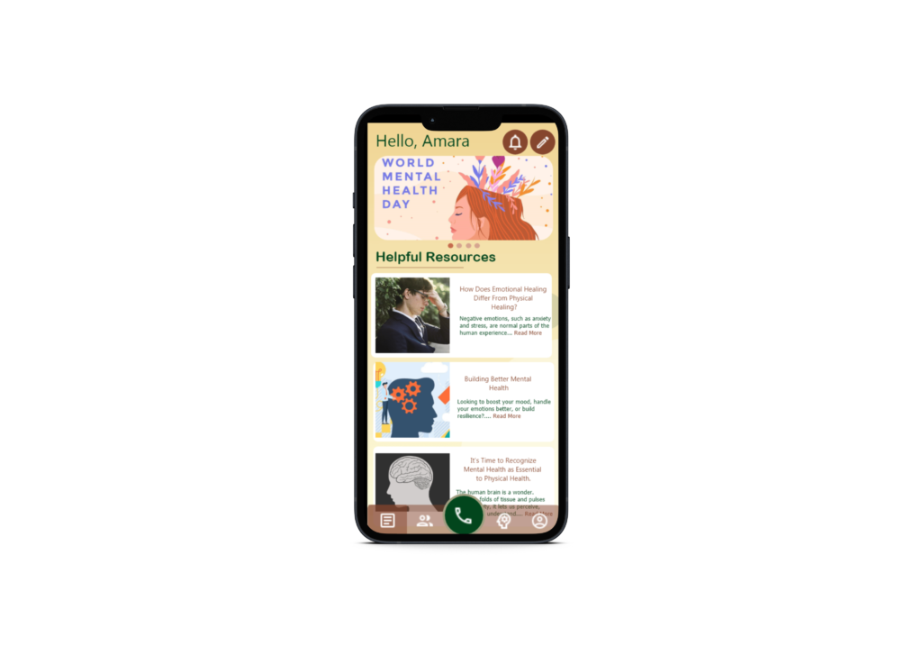
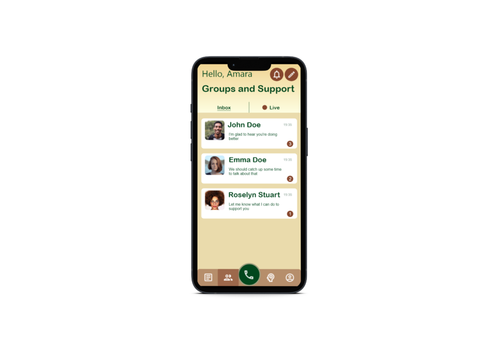
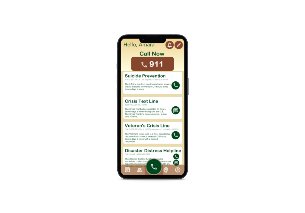

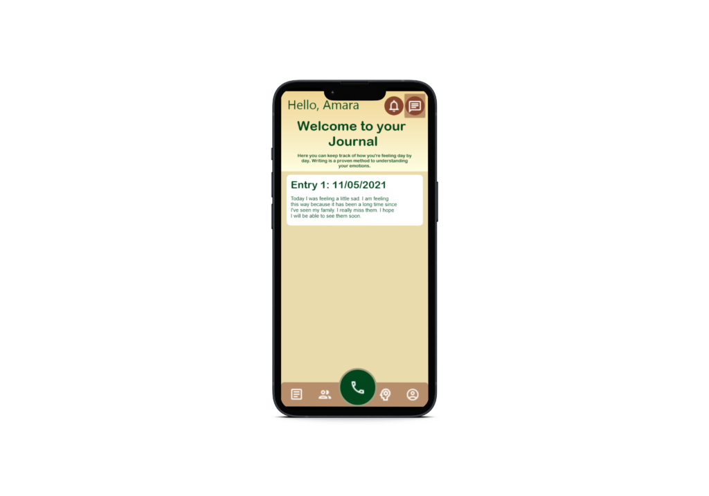
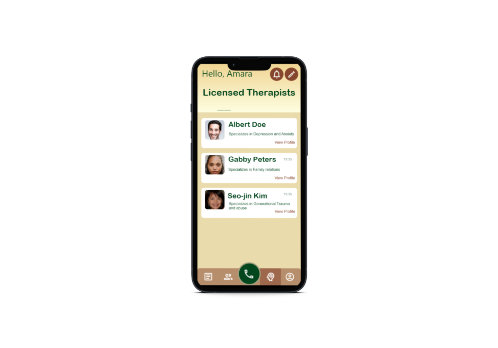
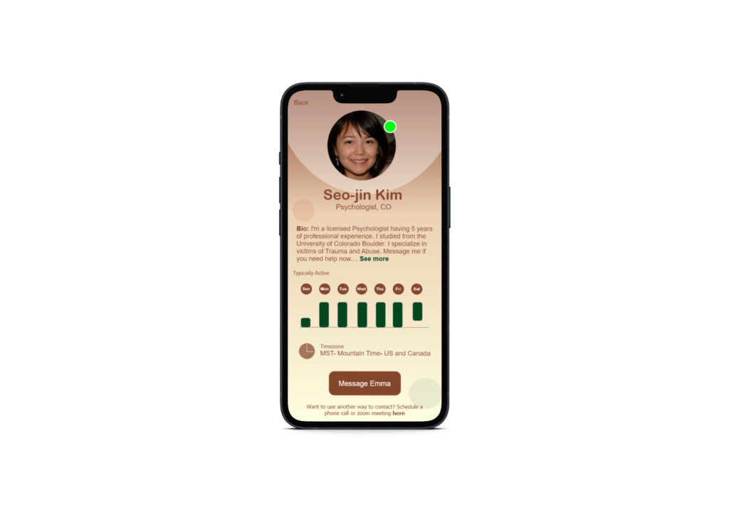
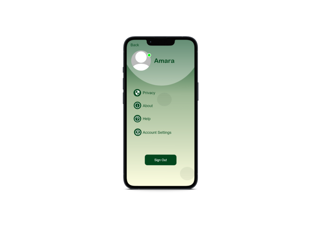
Challenge
Scope
Tools
Miro
Figma
Role
Proposal
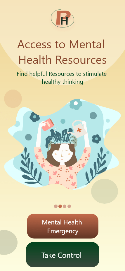
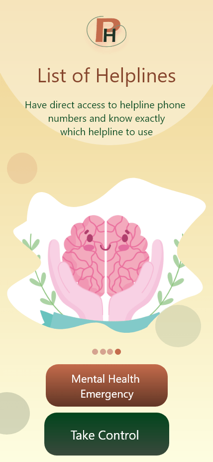
Usually a mental health crisis can use the 911 number but the general public should have a way of identifying the difference and better understanding their situation in order to call the right hotline. It’s also important for more services to be available to the public that may require specific attention to reduce the number of calls from one hotline and based off this situation having the right kind of help in order to have better guidance in solving their problem.
Empathize
Research Goals
............
- Identify information regarding the current statistics surrounding emergency help
- Determine what solutions already exist and compare and contract their pros and cons
- Understand how to produce a better solution for users
Assumptions
..............
- There is a problem with the amount of emergency service calls received
- There are some solutions already in the market place the specific scenario I want to tackle (mental health emergencies and crisis)
Methodology
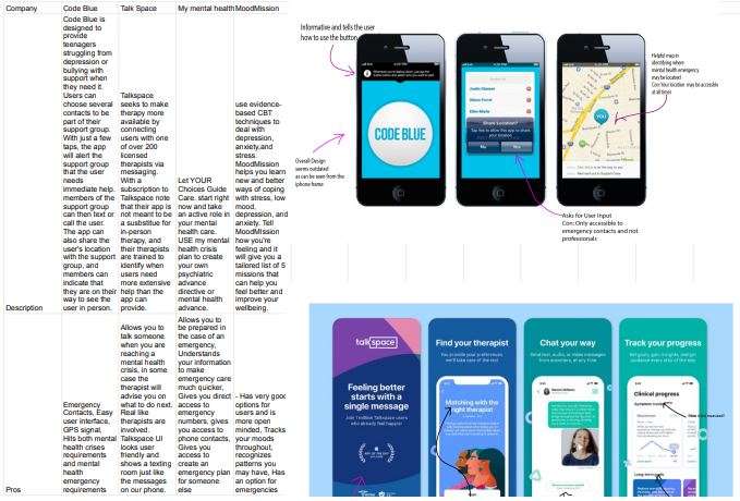
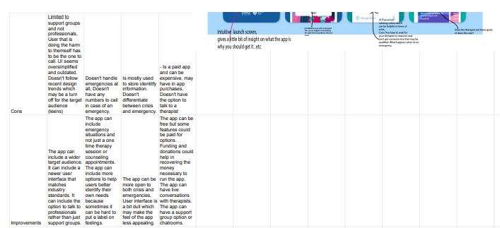
Competitive Analysis
- Determine who provides similar apps
- Identify the strengths and weaknesses of each
Competitve Analysis
Define and Ideate
Defining: Deals with synthesizing the research findings and creating user stories,scenarios and personas. Towards the end we are able to identify a problem statement that we will be solving in the remaining process. Identifying the right problem is as important as solving the problem.
Ideation: Ideation is the mode of the design process in which we concentrate on idea generation. Mentally it represents a process of ‘going wide’ in terms of concepts and outcomes. Ideation provides both the fuel and also the source material for building prototypes and getting innovative solutions in the hands of the users.
Methodology
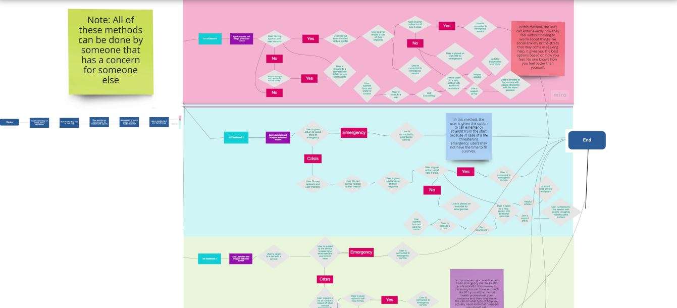
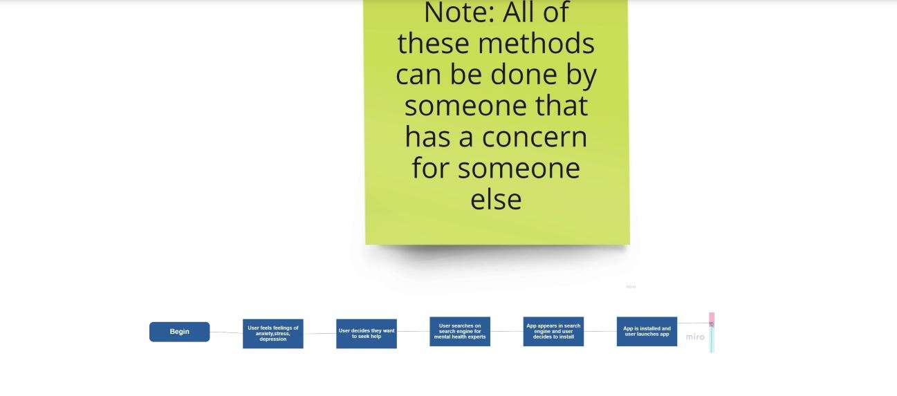
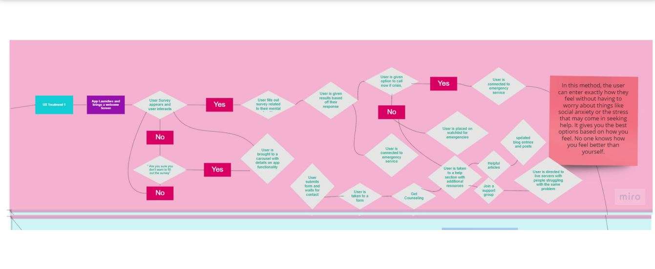
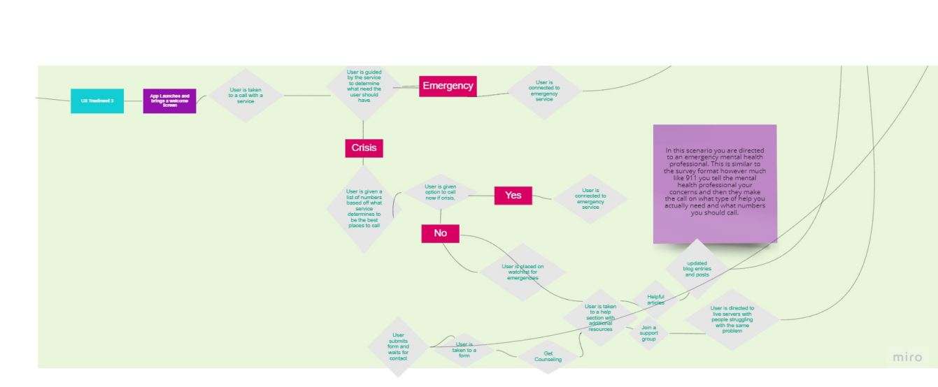
- identifies a path the user will take when using the app
- This path is taken from launching the app to calling the necessary hotline

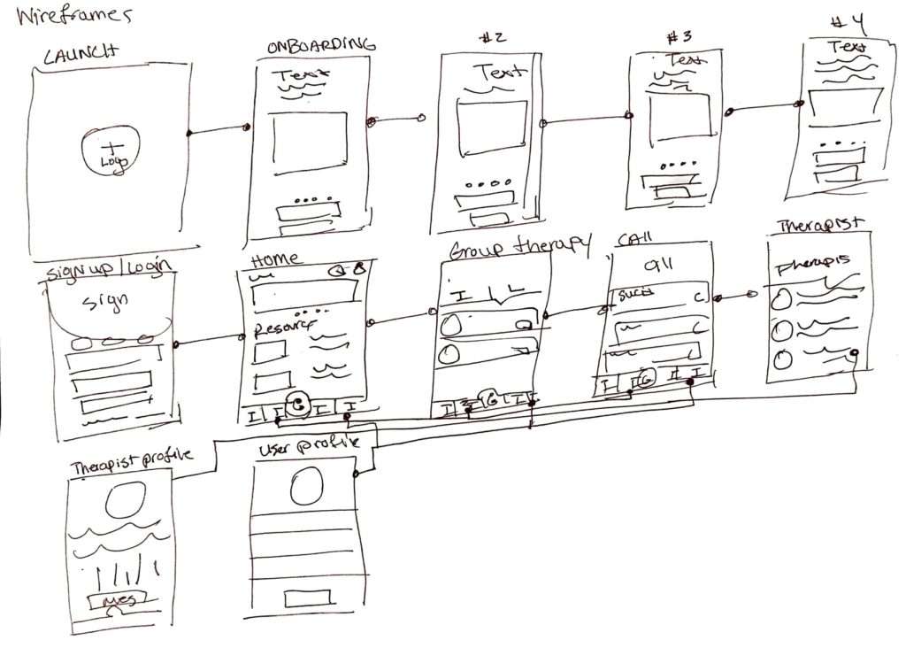
Wireframe Sketches
Hi-Fidelity Frames and Prototype
Usability Testing
Usability Test Plan
- Determine the user’s ability to navigate through the application
- Identify user’s pain points
- Determine each user’s thought processes while completing tasks
- Improve design functionality based on feedback
Research analysis: Quantitative: Users found some functions of the application to be overwehleming sucha s the description of each healthline. Users also had some confusion while navigating through the prototype. Qualitative: Users found the user interface to be easy to understand and understood the function of majority components. Users complemented the onboarding experience and found it intuitive and helpful.Feedback was prioritized based off of bias and purpose of the application. If feedback aligned with the purpose and helped to add to the purpose, the design feedback was taken. However, some feedback was biased based off an individual and thus would require further statistical research in order to make iterations.
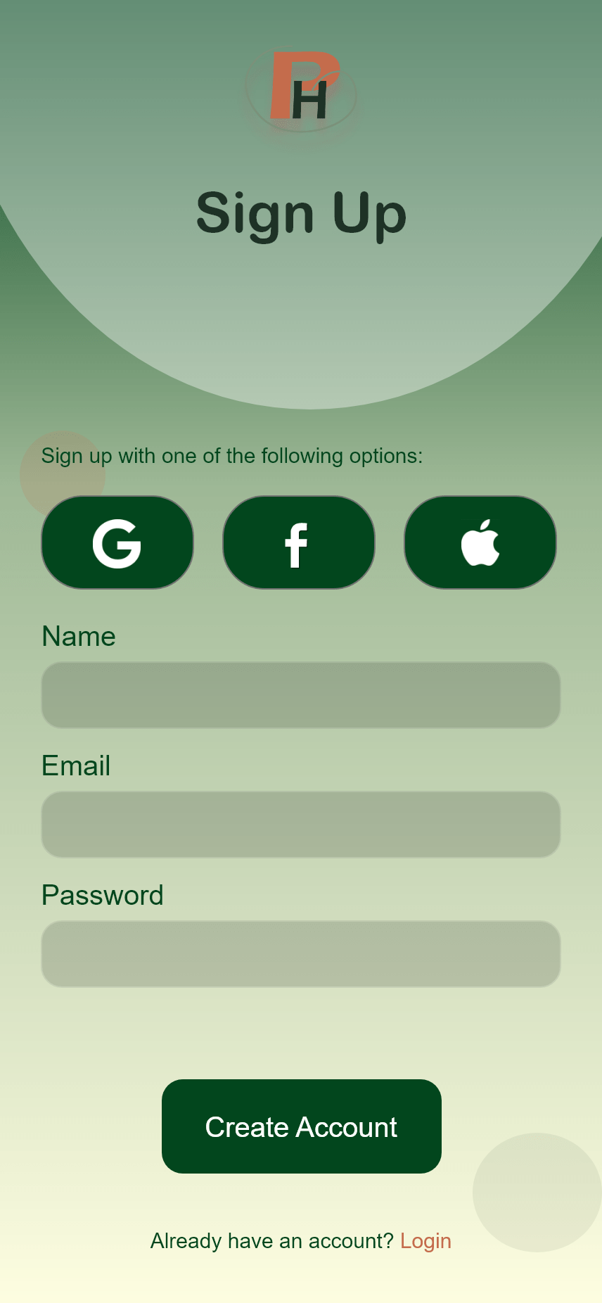
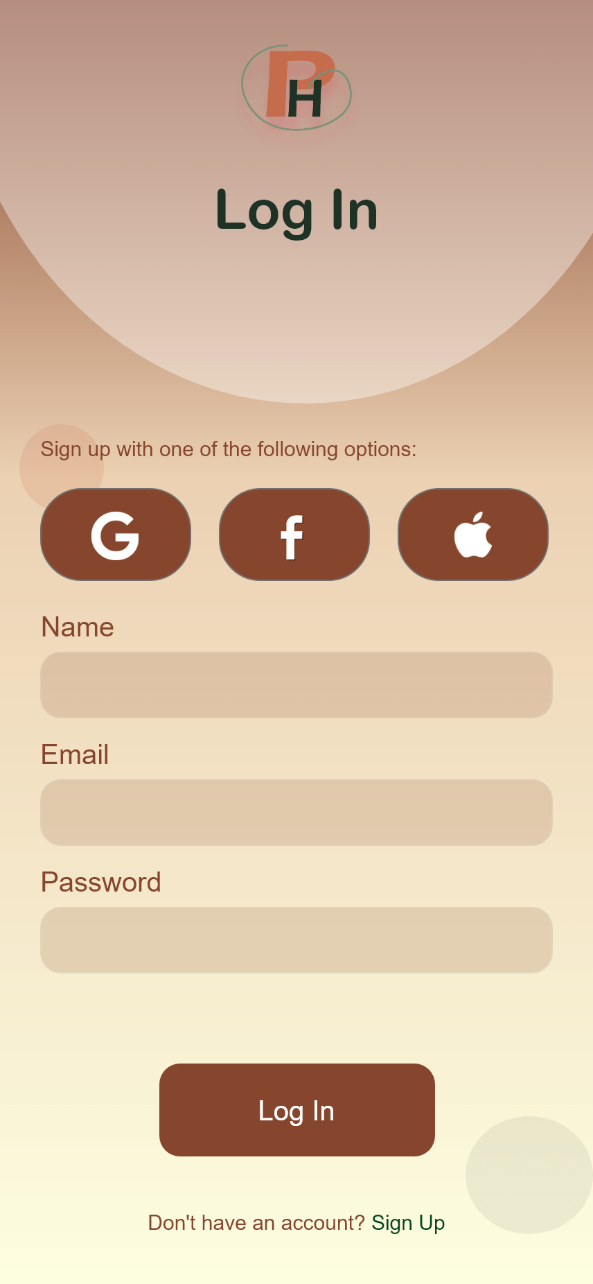
Implemented Designs
Takeaways
I learned that by using interface guidelines the actual design part of the project becomes a lot simpler and easier to do. The interface guidelines have a general list of things that are commonly implemented within applications and so by using them your app can look like it actually fits in the app store. I also realized how much in depth research works needs to be done before you can actually start creating wireframes and prototypes. This work helps identify user needs and makes sure that you target the problem at hand.
What was the most challenging part of this project?
Personally the most challenging part of the project was creating the actual screens and also trying to figure what screen would do what and how the overall architecture of the application would be. Although having done the research, there was so much to sort out from the research that I had to sit back and see if I could create collections of like items and see what screen would be the most suitable for each scenario. I didn’t want the application to be overwhelming but I also wanted it to meet all user needs.
How will you improve your design process for future projects?
For future projects I think I can begin to organize information early on in the process as opposed to when it is time to actually develop the screens. That way I have an idea of what screens need to be implemented rather than having to go back and forth between research and designing the screens to figure out how many screens I’ll have. I’ll also try to meet AAA requirements early on so that I don’t have to go back to the designs to change the colors.
What advice would you give other designers?
I would highly recommend following the apple guidelines. These guidelines are universal and can seriously guide you in what screens to develop and how to develop them. Because app design has so many branches, it can often become overwhelming when you don’t know what elements to use. The guidelines give you a really good head start and idea on what to build which then you can later on change to fit your app needs.

